Lynn Roddy Brown


Choosing Fabric for Scrap Quilts
Lynn Roddy Brown
I have found two things important in choosing fabric for scrap quilts: value and visual texture. Value is the relative darkness or lightness of the fabrics. Most fabric has a pattern that is created by differences in value or color; stripes, dots, plaids, vines, and florals are all examples of visual texture.
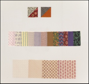
The first half-square-triangle unit has a strong shift in value that will help create a pattern over the surface of the quilt. The second unit has a shift in color rather than value. This will cause the pattern to be lost.

When I select fabrics for a scrap quilt that will have an overall pattern across the surface of the quit I like to have a gap in value between the light and medium/dark fabrics. This is shown in the strip of fabrics.
I found four red with white or cream prints in my stash. I have arranged them in order by visual texture. The first fabric will probably read as white from a distance and not add interest to the quilt. In my quilt I would prefer to use the middle two examples. The last fabric has almost even amounts of white and red. It could work if paired with a very dark like navy.
Tips for Choosing Fabrics:
-
• I consider fabrics with white or beige backgrounds very light and those with pastel backgrounds
medium light. The smaller the motif the lighter the fabric will appear from a distance.
-
• No large white or tan spots in medium/dark fabrics.
-
• No clear bright colors.
-
• No solids.
-
• No Moda Marbles.
-
• Limit tone on tones (fabrics with one color). If you bring them they should have visual texture.
-
• Choose a variety of texture, scale and color.
-
• If you have doubts about your selections, bring extra and I will help you choose.


